
 Yahoo Movies
 What’s really happening with emissions and the climate crisis in Australia
Australia’s greenhouse gas emissions dipped fractionally over the past year.
National emissions in the year to September 2023 were 459.7m tonnes, 0.5% less than the previous year, according to data released by the federal government.
But that’s only part of the story.
The charts below cover historic and future emissions, how Australia compares with other countries and how much greenhouse gas the country exports. They also look at much longer it has left to get to zero emissions and play its part in living up to the goals of the landmark 2015 Paris agreement.
default
Australia’s ‘fair share’ of future emissions
Australia’s legislated 2030 emissions target is a 43% cut compared with 2005 levels.
Official projections released in late 2023 suggest the country is slightly behind the pace to meet this target.
It is projected to cut emissions by 37% by 2030 under a baseline scenario, based on operating policies. This improves to a 42% cut in emissions under a “with additional measures” scenario that includes policies still being designed and implemented.
But this analysis doesn’t answer a key question: would 43% be enough?
The carbon budget countdown clock below shows how long is left until Australia has emitted its “fair share” of future emissions on its current trajectory.
It is based on the emissions trend only – it does not take into account changes in government policy.
You can toggle between calculations of Australia’s fair share in limiting global heating to 1.5C and 2C, the two goals included in the Paris agreement. Scientists warn there is a substantial difference in the likely climate damage between heating of 1.5C and 2C.
default
The next chart presents the information in the countdown clock in another way. It tallies Australia’s estimated emissions since 1850 and shows what different 2030 targets would mean for staying within different carbon budgets.
If Australia sticks to its 43% goal for 2030 it is likely to go beyond its fair share of limiting global heating to 1.5C later this decade.
default
The next chart shows the trajectory of Australia’s emissions since 1990, and what meeting different targets would mean if reductions were made in a straight line between now and 2030. You can toggle to see the pace of cuts that will be needed to reach net zero by 2050.
The government’s latest national greenhouse gas inventory quarterly update said emissions decreased by 0.5% in the year to September 2023. Emissions from electricity generation fell by 4.9% as solar and wind energy continued to displace fossil fuels.
But pollution from transport increased by 4.5%, in part due to the ongoing recovery from Covid-19 lockdowns, and emissions from farming were up by 2.5%.
The government said total national emissions were down 25.4% since 2005.
default
But the picture changes significantly if you exclude changes in emissions from the land, which mostly have nothing to do with climate policy.
You can toggle in the chart above to exclude emissions from land use, land-use change and forestry, known as LuluCF. It shows that nearly all of the cut in national emissions since 2005 has been due to a reduction in agricultural land-clearing and forestry.
Put another way, estimates suggest there has a significant increase in how much CO2 is stored in Australia’s vegetation and landscape.
These changes have been mostly due to state government decisions and a decline in the market for native forest logging. Both land-clearing and forestry continue on significant scales, but the greenhouse gas accounts reflect that they have reduced since 2005.
Emissions from the rest of the economy – mainly fossil fuel industries – are down only 2.5% since 2005.
The next chart shows the change in emissions in different sectors since 2005.
The following chart shows an estimate of how much other countries emit when they burn Australian fossil fuels. China and Japan have been Australia’s biggest markets for coal and gas, but China has recently had an informal ban on importing Australian coal.
Emissions from burning Australia’s black coal are mostly not reflected in national emissions accounts. The bulk of the coal is sold and burnt overseas, as the following chart shows.
How Australia compares to the world
Australia’s emissions reduction target for 2030 has increased since the Albanese government was elected in May 2022, but it remains behind most other similar countries.
default
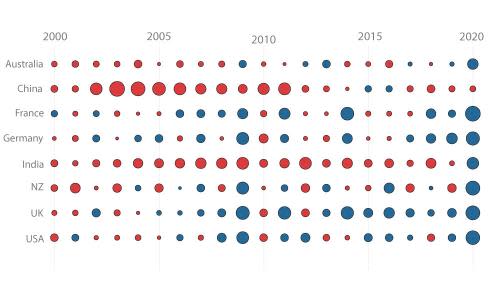
This chart shows how emissions have changed year-by-year from some developed countries since 2000. Emissions from land use changes – LuluCF – are not included. Red denotes increases and blue shows decreases. Australia’s emissions mostly increased, or stayed about the same, until Covid-19 hit.
default
This chart shows how much different countries emit per capita. The deeper the purple, the higher the pollution.
default
The consequences of global heating
The graph below shows the change in average Australian temperatures since early last century.
The Bureau of Meteorology says the average land surface temperature across the country has already warmed by about 1.5C since 1910.
Finally, here is a look at some recent extreme events that were more likely to occur, or more likely to be severe, due to rising atmospheric greenhouse gas concentrations.
This article is being regularly updated to reflect new data releases. Any significant corrections made to this or previous versions of the article will be footnoted in line with the Guardian’s editorial policy.
Notes and methods:
Emissions values are based on tonnes of carbon dioxide equivalent greenhouse gases (AR5 values).
Carbon clock uses the “fair share” carbon budget as a baseline, originally calculated as 10,400,000,000 tonnes of CO2-e between 2013 and 2050.
Guardian Australia uses the quarterly National Greenhouse Gas Inventories to calculate emissions since 2021, creating a daily average from the previous year to calculate how much longer before the fair share threshold is breached.
Carbon clock uses one second ticks based on the greenhouse gas emissions from the previous year.
Per capita greenhouse gas emissions by country are based on the latest release of the Global Carbon Budget from the Global Carbon Project.
Estimated combustion greenhouse gas emissions from Australian fossil fuels are calculated using production and export volumes from the Australian Resources and Energy Quarterly.
Domestic consumption of black coal is estimated by subtracting annual exports from annual production.
Volumes of fossil fuel exports are converted into energy units using factors from the Australian Energy Statistics.
Emissions factors for energy from fossil fuels are calculated using figures from the Intergovernmental Panel on Climate Change.
Thanks to Tim Baxter for providing feedback on several graphics. Any errors remain the fault of the authors.
