Review of Apple’s iPhone 14 and iPhone 14 Pro: They’re leaning into it
Apple’s iPhone 14 lineup delivers on a bunch of different vectors this year with very few peccadillos or complaints. Apple is really leaning into its silicon lead to deliver big gains year over year in cameras, and it’s leaning on its design teams to give users new ways to interact with their very familiar devices.
The always-on display does what competitors have done, but better and more logically. The cameras improve upon the already dominant iPhone 13 Pro’s arrays, especially in low light and telephoto performance.
This year’s iPhones also defy inflation to offer better performance, better battery life and improved connectivity at the same price as last year. Through some lenses this actually makes them cheaper for much of the world -- though the dollar’s relative strength has led to a higher cost in Europe and elsewhere.
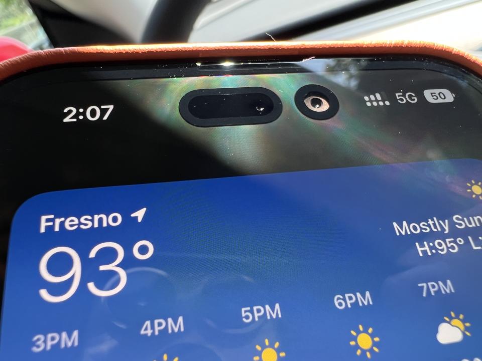
Even the "Dynamic Island" (a pill-shaped area that houses the iPhone’s front camera and other sensors) actually proves to be clever and useful. I’d go so far as to say that Apple has pulled off a remarkable feat here in taking a reviled design concession -- “the notch” -- and turning it into a true tool that improves user experience.
As a note, this year I decided to do something a bit different with my review of the iPhone. Typically I will try to fit in a solid experiential tour with the new devices because I prefer to have a real-world take on it by the time the public starts to get them.
But there is an enormous amount of time pressure there and I never feel like I’ve really lived in them long enough. So this year I’m going to drop some initial impressions today based on testing some of the marquee new features and then I’m going to take a couple of weeks to layer on some experience-time with them. If my initial impressions stand, I’ll likely just update this post.
Color
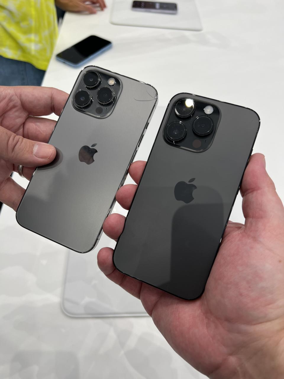
I had access to the Deep Purple and Space Black models of iPhone Pro and the Blue iPhone 14. The Space Black, I’m happy to report, is much blacker than the Graphite of last year. It’s not Jet Black, my all-time favorite iPhone finish, but you do get the deeply black hi-shine steel band at least. The back of the phone is still not super dark because of the frosted glass finish, but it’s far darker than last year’s.
Not my cracked iPhone. Image Credits: Matthew Panzarino / TechCrunch
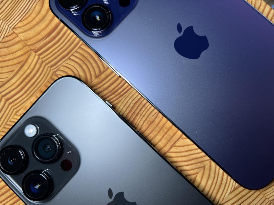
The Deep Purple is my personal favorite color this year and it’s what I ordered. It’s fairly dark overall, but shows well when the light hits it. This is going to be a fan favorite, I think, and will do really well with a transparent case.
Image Credits: Matthew Panzarino / TechCrunch
The Blue in the iPhone 14 is fairly milquetoast in my opinion. The winning colors that I saw in the hands-on area at the event last week were Purple, which brought back a shade close to the iPhone 12’s lavender and the (PRODUCT)RED, which is a really bold Pat McGrath-esque uber red that verges on magenta. Really nice in person.
eSIM
This year, Apple shipped test iPhones to reviewers with a line of service attached. This meant that when I booted up the devices for the first time I was presented with the option of activating that line or adding my own. I added both to get the full dual-line experience and it went smoothly. Apple has had eSIM in iPhones since 2018, so they’ve had some practice at this, but it was overall aggressively pleasant.
Adding my line even though I was "converting" from a physical SIM was painless. Once I added it I was taken through a nicely designed flow to choose which number I would use as primary, which data plan I would use and whether I wanted to blend the plans to use whatever data was faster at the moment. The new signal indicator, which shows both services on it, takes some getting used to, but is otherwise nicely done.
You can add up to eight lines to the iPhones 14 and you can name each one separately to keep track of them. If you’re purchasing a region-locked iPhone you’re going to get the same experience that you do with a physical SIM in that you need to purchase a travel plan if you’re going overseas. If you’re buying an unlocked phone you can add lines from any carrier anywhere to it at will, which is neat.
Google added the ability to use Fi in eSIM a while ago, so I’ll probably be using both my Fi line and my carrier line in my personal phone when it arrives.
Internals
Apple says that all of the iPhone 14 models have a new internal structure that allows for better thermals and heat dissipation. It’s next to impossible to determine if there is any real benefit here in my testing, though I’m sure that a teardown will display whatever architectural changes Apple has made. Whatever has changed, it is significant, because the iPhone 14's back glass can now be replaced without having to disassemble the phone, something that was not possible before.
The display can now also be replaced without having to remove the True Depth Camera module from it as well. The cost of repair for these kinds of problems goes way down as a result.
Image Credits: Matthew Panzarino / TechCrunch
There is now an ambient light sensor on the back of all new iPhone models -- something that is used to adjust display brightness but also to determine camera exposure. This can help when moving suddenly into or out of big backlit scenarios. This is also hard to verifiably test -- especially as the camera and screen adjustments are already well supported by existing sensors.
I would love to see Apple finally convert at least the iPhone’s pro models over to USB-C. It just makes sense at this point, given that Lightning was originally given a roughly 10-year “for the next decade” lifespan when it was announced. But I get the feeling Apple’s not happy being forced into anything to do with a connector choice by the EU or anyone else. So your guess is as good as mine as to when that will happen.
Image Credits: Matthew Panzarino / TechCrunch
For those of us not used to having it, the always-on screen does take some getting used to. I found myself habitually thinking that the phone had just gone into that brief "dimming" stage before it turned off. As someone who runs with the "show notifications but hide the contents" setting already, I didn’t have to adjust behavior much, but if you keep the contents of your notifications visible you may want to rethink your strategy there.
And for those of you who just don’t like the new way, yes there is a stay-off-my-lawn setting to turn off the always on behavior in the settings app.
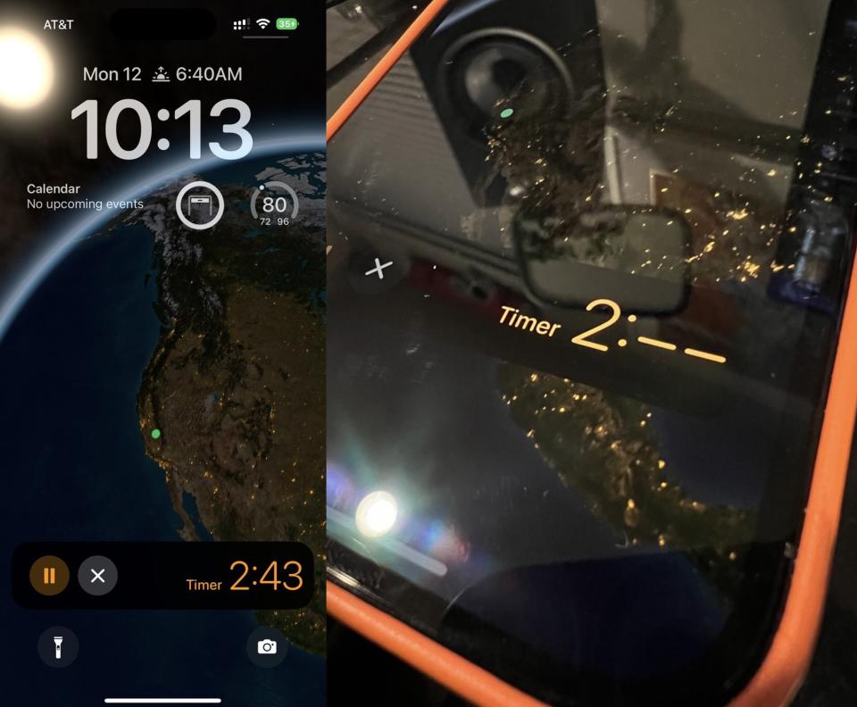
The new A16 ability to ramp the display down to 1Hz lets them leave the screen on without materially affecting battery life, but by nature you will likely get a small amount of extra life by leaving it off. Some other interesting side effects of the refresh rate dropping down to sub 1 second is that any timers you have running will show only to the minute while the display is in ‘off’ mode unless the timer has less than 2 minutes left, in which case it will ramp back up enough to show you that the seconds are ticking away.
Image Credits: Matthew Panzarino / TechCrunch
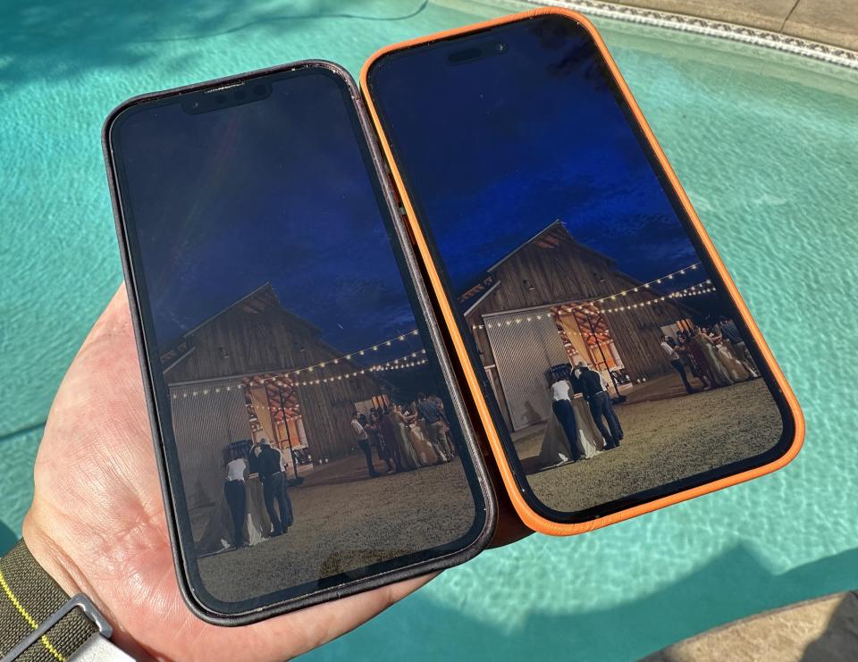
The display is noticeably brighter in daily use. Not enough to feel like a violent change from the iPhone 13 Pro but even then there is a delta and it’s more than on paper -- it’s brighter, period. Apple claims it can spike to 2,000 nits, but for most people that’s a pretty random number.
To give you at least some comparison, I shot an exposure locked frame from an iPhone 14 Pro Max of the same image displayed on both the iPhone 13 Pro (left) and iPhone 14 Pro (right). I believe the resulting shot gives a fair approximation of how much brighter the iPhone 14 Pro’s screen can look in direct sunlight.
Image Credits: Matthew Panzarino / TechCrunch
Because I’m almost constantly bombarded with notifications, my habit has been to lay my phone face down on the table. I think that cue will become much more common now that the always-on screen will continue to show notifications coming in unless you’ve customized your focus modes to keep them in the quiet place until you go looking for them.
All of this aggressive variable frame rate (VFR) adjustment has led to pretty solid battery life across the lineup. I didn’t run any formal battery tests this year but still got a solid day’s use and then some once they finished indexing. One interesting quirk is that the iPhone 14 actually gets a higher battery life rating for audio playback and lower ratings on the video tests. Once again, this is VFR at work as Apple dynamically adjusts the refresh rate of the screen in video playback.
Cameras
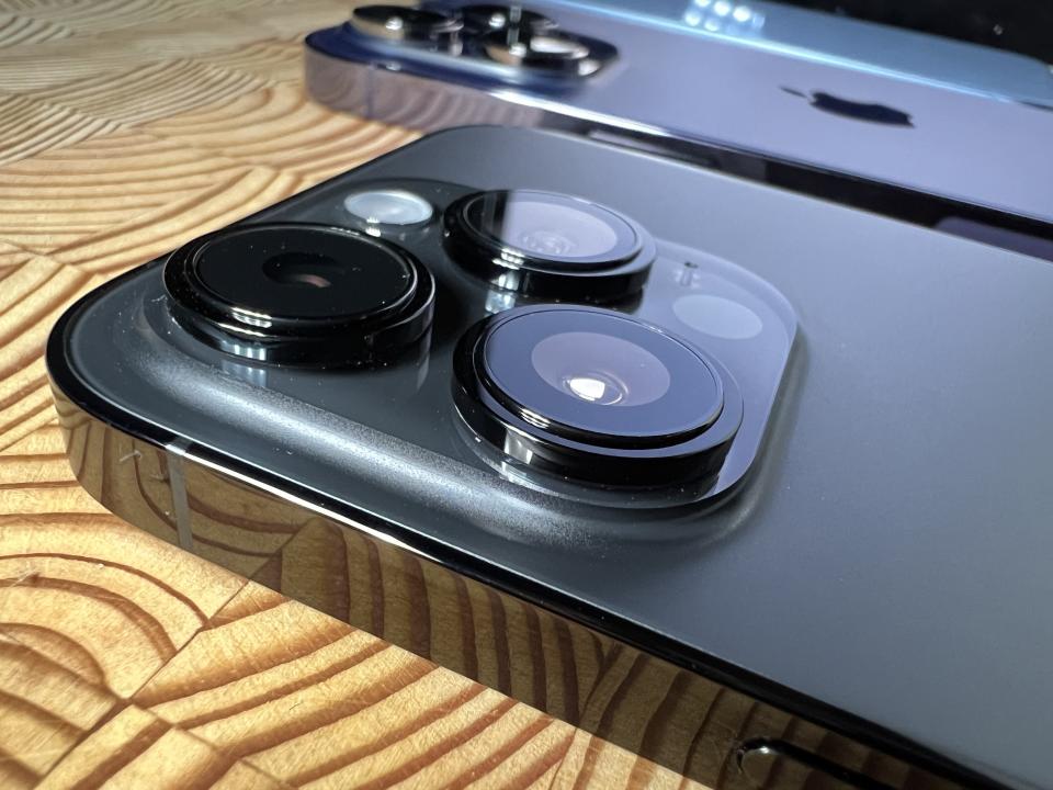
The iPhone 14 Pro has one of the best compact cameras ever made onboard. It strains against the limitations not of its software or image pipeline but against the physics of sensor size and light gathering. And, mostly, it succeeds.
In years past we could and did predict and joke about a far-flung future where the image quality of iPhone rivaled or surpassed a dedicated removable-lens camera. The iPhone 14’s leap to a quad-Bayer coded 48-megapixel sensor turns the corner from maybe to eventually. It’s no longer if, it’s when, and the when is probably more a matter of your use case than it is about the camera’s capability.
iPhone 14
The majority of the impressions you see in this piece come from extensive use of the iPhone 14 Pro, because the most dramatic updates live there. But I thought I should dedicate a section of this piece to talking specifically about the iPhone 14. For the second year in a row, Apple delivers a really enticing "entry" point to the new lineup. Though I have a personal predilection for telephoto focal lengths that would never allow me to settle into the "wide and ultra-wide only" lifestyle -- I have to admit there is a strong appeal.
With the excellent base of the A15 Bionic, a brand new main sensor with a 49% (not 50, never catch Apple lacking, they use number numbers) better light gathering and access to the new image pipeline with the Photonic Engine -- and all of the new safety features like Crash Detection and Emergency SOS via satellite, the iPhone 14 becomes a really, really tempting buy. When you add to this that the color palette of options available is bolder and more fun than the somewhat reserved Pro lineup, you’ve got a killer-looking deal.
Yes, you’ll have to live with the fact that Apple is likely making better margins off your purchase given that they’re shipping last year’s top of the line chip again in it, but I’m not sure that’s a dealbreaker. Given that the performance headroom of Apple’s chips far outpaces their yearly release schedule, you’re going to be hard-pressed to notice any shortcomings, if there are any.
The iPhone 14 is pleasant to use, friendly to look at and extremely capable. The lack of the advanced cameras in the iPhone 14 Pro is leavened a bit by the image pipeline delivering Action Mode, 24p 4K shooting and improved zoom interpolation while filming. Those could easily have been reserved for the Pro models and I doubt anyone but some close observers would have complained. But you get all of it.
And this year they even have "the big one" if that’s what you’re into.
The iPhone 14 Plus is shipping one month later than the other models of iPhone. Apple won’t say why but it’s very likely sourcing components -- the display being the main suspect -- that is pushing it back. That means that I do not have one here, so I’m unable to bring you any impressions of the larger screen on the "main line" model. But otherwise, the functionality of the iPhone 14 and iPhone 14 Plus are theoretically supposed to be identical. That’s something I can’t test, but we can assume for now.
Also, I know it’s heresy in some parts, but I really like the blasted aluminum trim over the shiny fingerprint-prone sides of the Pro models.
Camera stuff
My shooting with the iPhone 14 Pro so far has brought me to several conclusions, which I’ll lay out here and then dig into after:
Having a 48MP RAW image at hand is going to be huge for photographers, but essentially a non-feature for most people.
Apple’s Photonic Engine is interwoven with all of the camera improvements, though it’s difficult by nature to nail this down because so much of the process is happening on the raw images much earlier in the process. It’s not snake oil though, it’s in the mix because you can see the improvements in the iPhone 14 as well.
The quad-Bayer array in the Main camera delivers on its promise of adding fine detail, more light gathering and better color rendition.
The 3x telephoto camera is absolutely, 100% better than the one in the iPhone 13 Pro. That’s good because the previous one was not great.
A native 12MP 2x option is genius because it provides a near 50mm equivalent option for amazing candid shooting with zero interpolation due to the perfect 12mm crop fitting inside of the huge new sensor. It’s my favorite new mode.
The Ultra Wide camera is vastly improved from the iPhone 13 Pro -- it focuses faster and shoots way better in low-light conditions.
Image Credits: Matthew Panzarino / TechCrunch
Forty-Eight Megapixel
If you were in the room during the Apple presentation you would have heard the immediate susurration that ran through the room in reaction to the words “48 megapixel”. My head certainly snapped up from typing in our liveblog. A 4x jump in pixel count in a single year was unheard of for iPhone -- in fact, they hadn’t increased it at all since the jump from 8MP to 12MP in the iPhone 6s.
An increase in pixel count of this size wasn’t automatically a reason for euphoria, however. The Nokia Lumia 1020 had a 41-megapixel sensor in 2013, for instance -- and though the images were serviceable, they weren’t materially better than what the 8MP camera in the iPhone 5s delivered -- and in most cases the consensus was the iPhone won out handily due to better processing choices.
In fact, adding more megapixels has been a dangerous game that manufacturers have been playing for decades in digital cameras. Because higher megapixel numbers on the box were an easy way to sell cameras at big box retailers, they kept climbing. But more pixels means more heat and more noise and often smaller pixel pitch (size of individual sensor elements). This quickly degrades image quality if you don’t have enough horsepower to correct it at the ISP. But manufacturers eventually turned toward larger sensors once a natural equilibrium around the 10-12MP mark was hit for compact cameras. At one point Canon even pushed back on the market, dropping the total pixel count of a new sensor in order to improve light gathering, noise and overall quality.
But the 48MP camera in the iPhone 14 Pro doesn’t fall into the trap of selling based on raw number of pixels. Instead, it uses a Quad Bayer design to take four individual pixel sensing elements and "bin" them -- combining their information into one mega-megapixel that offers better low-light performance with less noise.
Image Credits: Matthew Panzarino / TechCrunch
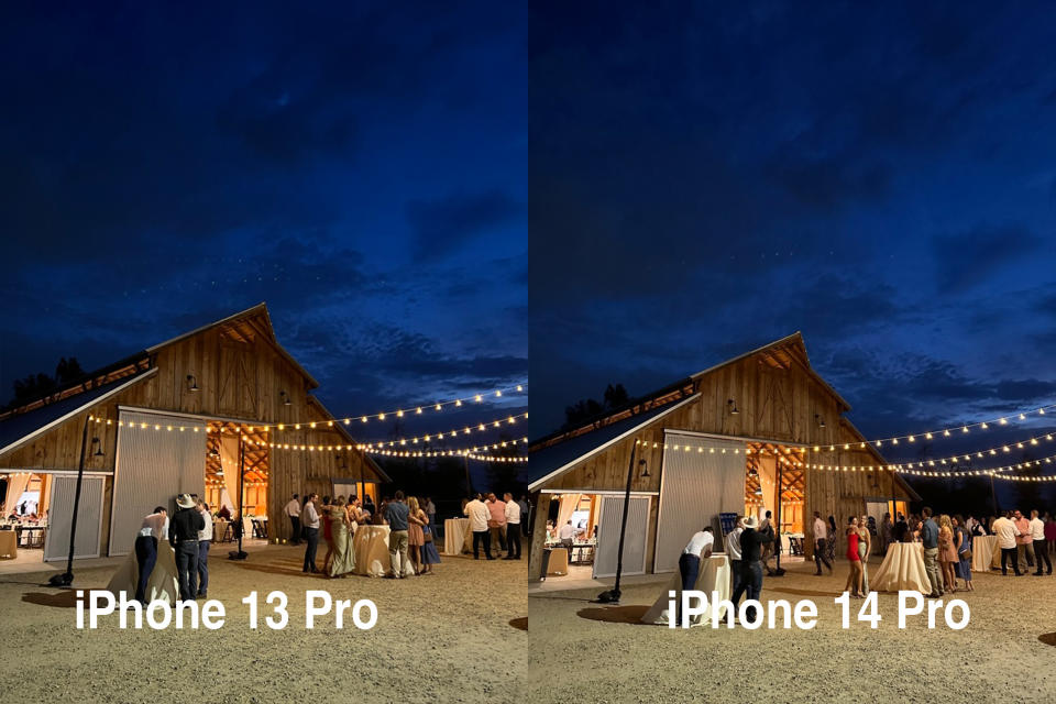
You can see the vastly improved detail in these night mode RAW images, both shot at 12MP just to be “fair”.
The resulting image is always 12MP coming out of this camera from Ultra Wide through Telephoto if shot in JPG or HEIC. But a couple of quirks arise here, which allow for some interesting interactions.
First, of course, photographers who are serious about taking as much control of the image as possible now have access to 48MP of RAW image data to play with -- an ML-interpolated version of what the quad array would produce for that image. While on an individual basis the pixels are individually smaller at 1.2 µm, there are four. So they combine to make up a 2.44 µm photosite. Bigger is better, in this case, because it produces lower noise images.
Photonic Engine
Driving improvements across the model lineup is a new image pipeline Apple is referring to as the Photonic Engine. The big revelation here is that Apple is taking the raw captures -- four main frames and two-three secondary frames -- from the sensor and doing its combination work on them through Deep Fusion before it does any adjustments, including de-mosaic, noise reduction and color correction.
By interpolating the images earlier in the pipe, the ISP can work on these bigger, more information-rich 16-bit RAW exposures -- allowing it to retain fine detail down to the final 12MP JPEG.
Image Credits: Matthew Panzarino / TechCrunch
The "why now" of Photonic Engine seems to boil down to a handful of factors, the most prominent being that the newly enhanced internal design dissipates heat better, the image pipeline is better integrated and the 5-core GPU in the iPhone 14 is considered minimum viable to pull this off without any lag in shooting. The improved pipeline and thermals appear, as far as I can divine in my casting about, to be why the iPhone 13 Pro cannot utilize the same process.
The results in my testing appear to be crisper images taken at any focal length, with strong color rendition that tends toward saturated neutral tones. Where the iPhone 13 Pro’s pipeline generally trends warmer, the iPhone 14 and iPhone 14 Pro present a ramped up but cooler (and truer) image in most conditions.
It’s difficult to test most of the cameras against one another in order to create a true comparo for Photonic Engine because nearly every one has some new hardware involved as well. And all of them are getting whatever ISP enhancements have been made aside from the Photonic Engine specifically.
I had to do some digging here to figure this out, but I confirmed that the iPhone 14's Main camera is the same hardware as the iPhone 13 Pro's Main camera. So that's the only way I can see to test how much Photonic Engine/pipeline is contributing to the images directly. All other cameras have new hardware of some sort involved.
In my testing of these two cameras against one another I found that the updated pipeline delivered strong results. With the same hardware, the images from the iPhone 14’s camera displayed better overall sharpness and color rendition in bright conditions. In low-light conditions the dynamic range was also expanded -- highlights retained more detail, for instance. That’s likely due to other pipeline tweaks as the Photonic Engine does not, by itself, increase dynamic range -- it just preserves more detail for the latter parts of the process.
These differences aren’t momentous, but I don’t know if there’s going to be a lot of people migrating from the iPhone 13 Pro to the iPhone 14 anyway. I just found it an interesting way to test whether the new pipeline delivered better results on essentially identical hardware and the answer is yes.
The Main Camera
Another fun in-keynote moment was when Apple renamed the Wide camera across its iPhone lineup. I was sitting with Apple writer and student John Gruber when he noted that they had just called this default camera the "Main Camera" for the first time.
This Main Camera jargon makes logical sense and will clear up a lot of confusion about whether we were talking about the wide or the wide wide. I will, however, dispense with the capitalization, trade dress be damned.
Whatever it’s called, the main camera was the biggest recipient of upgrades this season, with the aforementioned quad Bayer 48MP sensor and Photonic Engine at the heart of it. In my testing, the improvements are immediately clear over the iPhone 13 Pro. And in an easily visible way too -- there’s no confusion -- it’s absolutely better.
Among the differences I noticed were better color rendition -- as mentioned above more neutral with boosted saturation. Improved detail in bright light. Improved detail and crispness in low light as well.
Image Credits: Matthew Panzarino / TechCrunch
The specs of the main camera are interesting for sure. The individual pixel pitch is lower than last year but the quad array gives it a total size nearly 2x bigger once four sensor sites are combined into one. The maximum aperture is smaller, but other factors are in play.
Hardware alone produces 17% more light, then the Photonic Engine comes into play, delivering 2x light gathering. The Sensor in the main camera is 96% larger in total than the iPhone 13 Pro. The total jump in sensitivity is rated at 3x from iPhone 13 Pro according to Apple.
Image Credits: Matthew Panzarino / TechCrunch
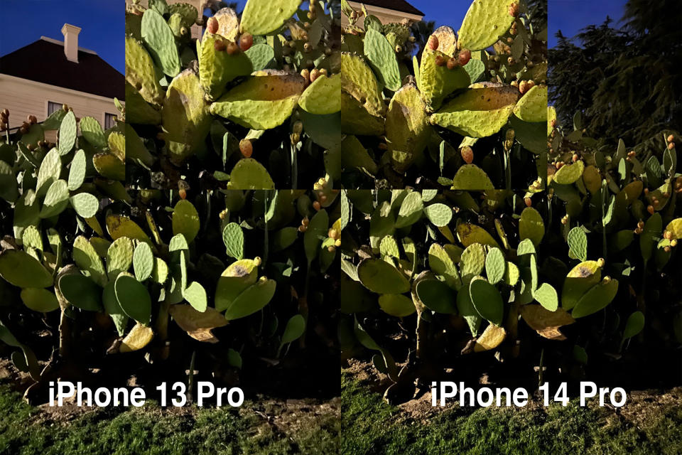
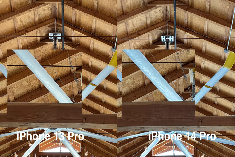
While exposures from the iPhone 13 Pro I shot alongside the iPhone 14 Pro still look pretty great, once you look at any detail areas or at the ends of the shadow/highlight spectrum the differences jump right out at you. There’s a general softness to the iPhone 13 Pro in comparison to the iPhone 14 Pro.
The change to 24mm is also interesting. The general rationale here was that 24mm is one of the most popular candid focal lengths in all cameras. In practice, it offers a sliver of extra real estate, but I doubt most folks will notice the change.
The "second generation" sensor-shift optical image stabilization system does seem to improve stability, but honestly it’s hard to tell. If you’re curious, the system had to be redesigned because the sensor is almost twice as large, so the rack and amount of shift had to be adjusted. It takes up less space than the previous version and Apple says that it is now more efficient.
Nifty 48
As a byproduct of the main camera sitting at 24mm, the 2x now hits right around 48mm equivalent focal length. It turns out that this is my favorite new shooting mode. Having the length back from the iPhone 12 Pro to take candid shots and have tighter framing without going "full telephoto" is a lovely surprise.
Because the native output is 12MP and the sensor is 48MP, the 2x mode offers a prime 1:2 ratio, delivering an image produced right out of the center 12MP patch. There is some ML work being done here on the quad Bayer of course, but the larger pixels and perfect 50% crop make this a solid lens from a quality perspective.
There’s a nice homage here too -- the term "nifty 50" has been used in photography for decades to refer to a lightweight, wide aperture prime lens at a fixed 50mm focal length. They’re often the first lens that anyone buys who is newly conscious of the quality of optics and the importance of wide apertures.
This new 2x mode has that comfortable feeling of nestling right into a sweet spot that allows for some creative framing without being too unwieldy. I think I’m going to get a lot of use out of this one for candid shots in and out of Portrait mode.
The new telephoto
I’m extremely happy to report that the new telephoto sensor and lens array is a solid improvement over last year’s model. Though the specs are very similar, I’ve confirmed that it is indeed a new sensor this year. That’s huge for me, because I shot nearly 60% of my photos at 2x or above in 2021. I love a telephoto for its ability to get picky about framing and margins.
Image Credits: Matthew Panzarino / TechCrunch
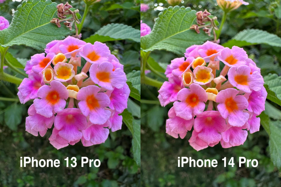
This new telephoto produces less noise and more detail than the 3x camera in the iPhone 13 Pro. Some examples that I was able to pull out were detailed stamping patterns in metal and the grain of wood. It’s easy to see that there’s been a generational jump here. Let’s hope Apple keeps paying attention to this very handy lens -- at least for my sake!
Ultra Wide
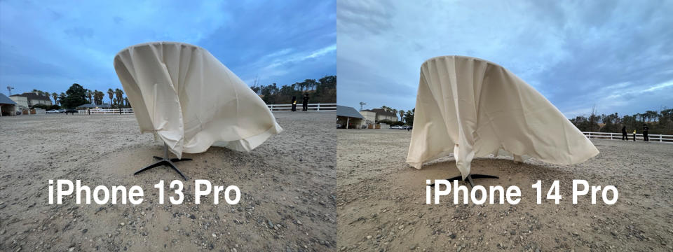
More open in shadows, sharper near the edges and overall better. That’s the verdict here. The 100% focus pixels means that it gets a better lock on subjects and does it quicker. The sensor is twice as big here and Apple claims 3x “better” low-light photos are possible.
Image Credits: Matthew Panzarino / TechCrunch
In my observance, the edges are sharper and there is less comatic nonsense happening in details there. It regularly turned in better images -- slightly sharper throughout and more open in shadows -- in my testing. Though the Ultra Wide got “very decent” last year when it got auto focus for the first time, I think this year it’s crossed the border into worth you seriously exploring as a storytelling tool, not just a "we need to get everyone in this picture" tool.
True Depth and flash
The front camera got auto focus. This is…nice? I think the vast majority of shots here were probably OK, but I can absolutely see it coming in handy for vlogging or livestreaming. The selfies I took with it were good, probably a tad sharper, but nothing incredibly overwhelming to report there. Group shots may benefit from this as well if you’re trying to fit everyone in -- the auto focus will track a bunch of faces at once and try to maximize sharpness across them.
It will also focus even closer now, so good for those "check out the ring" shots I suppose.
The flash is an interesting little upgrade too -- it now has nine LEDs that make up its surface, and the camera system can choose how to throw that light. For a telephoto shot, for instance, it can choose to send a bright, narrow beam. For a group shot with the wide it can turn on the edge LEDs to broaden the beam to catch the edges.
In practice I believe that I am getting better exposed flash images with softer overall light that look a little less harsh. That’s as much as I can tell though. I don’t shoot many flash images at all, frankly.
Video
I didn’t get to test out the video modes much, but they’re all trading hard on the silicon work -- cinematic mode moving up to 4K from 1080p is a testament to the amount of overhead that the A16 Bionic has to work with.
I did run a couple of tests on the action mode and zoom smoothing though. As you can see from the clips above, having a huge 48MP array to work with means that OIS + big overscan = big-time stabilization capabilities. Though the iPhone is a tad on the expensive side to be considered an action camera, it’s closer now than it's ever been to being near the top of that heap. I don’t think that Apple was exaggerating when they compared it to using a gimbal. It's worth noting that Action Mode cannot shoot in 4K because it's overscanning so much, so you're limited to 2.8K.
There’s also a neat trick that they pull now with zooming while in video mode. They steal a few frames of video from the buffer of the camera that they’re switching to, say from 1x to 3x, and use an ML-aided process to interleave them with frames from the current lens. This means that instead of the hard jump cuts you used to see while tapping from one zoom level to another, you get this nice rack zoom instead. It’s very pleasant.
Foreground blur in Portrait Mode
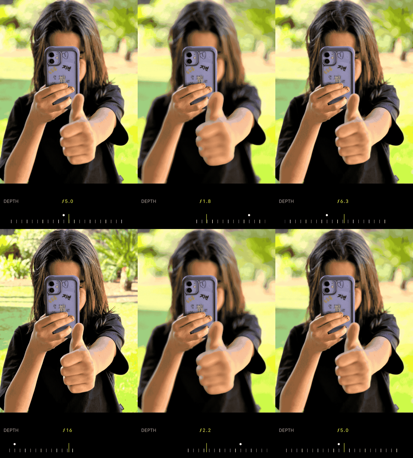
The upgraded segmentation of the portrait mode this year means that we now get foreground as well as background blur. The lack of a true "field of focus" that expanded outward from the subject and got softer organically as it traveled farther away has been one of the biggest roadblocks to helping portraits taken on iPhone look more natural -- as if they were shot with a true portrait-style lens.
Image Credits: Matthew Panzarino / TechCrunch
I wouldn’t say the execution is perfect here yet; if the subject is too close to the lens you get the natural bokeh of the optics in the camera with the foreground blur layered on top, so you can quickly see results getting cartoonishly ballooned outwards instead of softly blurred. Of course, if the segmentation falls over here you also still get an awkward mix of foreground and mid-ground elements that are not placed where they need to be spatially.
But if you strike a decent balance, keeping the subject at around 7-10 feet, and nothing too prominent near the center of the frame, it’s extremely convincing.
As with the original portrait mode, I’d say that this is one of those features that will evolve over time to get better and more natural. But out of the gate it really does level up the whole mode’s game, allowing you to place a subject in the midst of foreground and background elements and separate them out naturally. When they’re properly detected and segmented, of course.
Safety and security
Two main safety features were introduced to the iPhone 14 lineup: Crash Detection and SOS over satellite. I was unable to test crash detection because my local crash test simulator closed last year after an unfortunate watermelon incident. And SOS over satellite doesn’t ship until November.
But I think both features are massively compelling to anyone who travels or adventures solo. Especially in driving-heavy locations. In lieu of crashing my car, here’s a rundown of the way these features work.
Crash detection
Most common types of crashes are detectable by the feature:
Sedan
SUVs
Trucks
The feature is made possible specifically by software plus new hardware:
Dual core accelerometer that detects 256G (currently 32G) of force.
Between 100-200G of force is typical in crash scenarios.
New faster Gyroscope -- senses faster with more sampling per second.
The mic, GPS and barometer are also used.
Crash data is processed locally and when driving only.
When a crash happens:
There’s a 10-second countdown.
Dials emergency services, worldwide.
A voice looped message is transmitted.
Sends your location to EMS.
Alerts emergency contacts and sends your location to them.
Crash detection will also use satellite if there is no signal to send message to EMS.
The emergency contact message will say that this user has been in a crash (providing the name of the user if it is set in their My Card) and provide the estimated location of the user (if available) in a maps URL. In Messages on an iPhone, that URL will turn into a Maps window with the location shown as a pin. On any other device, it will likely show the URL and the user can click on it to open the web version of Maps.
SOS Feature
A new status indicator shows not in range (SOS) when there is no cell signal at the top of your device.
A simple 911 call to any cellular service activates the feature.
If you call 911 and you don’t get anything, then 30-60 seconds later it activates.
You then see an Emergency SOS via satellite screen with expectations about the service and connectivity laid out.
Then goes to tappable questionnaire that Apple worked on with emergency specialists to nail down.
You can choose to notify or not notify emergency contacts.
They can also see transcript of your SOS convo.
It then brings up a screen to guide you to pointing at a satellite.
A message then goes out to Messages app.
Grey chat boxes appear when you’re sending emergency messages.
You can also text 911 directly with Messages services.
That’s a function of Apple relay centers because most EMS providers don’t take 911 texts, though some do.
The relay centers are in U.S. and Canada currently.
Part of the training is calling the right services to cover the emergency and the area of emergency.
Your Medical ID info will go to them displaying things like medications, height, weight etc. from your medical card.
It uses a short text compression algorithm to send more quickly to a satellite.
The internals of the phone were adjusted -- including antenna tweaks and new software enable the connection to satellite -- so it uses the existing, but modified, antenna.
The feature will work for people traveling to the U.S. from elsewhere, even if they "don’t have the service".
One interesting detail is that you can also use the satellite feature to send a non-emergency location -- "we got to the summit" type locations, etc. to the Find My service to keep your friends updated on your location and progress.
Dynamic Island
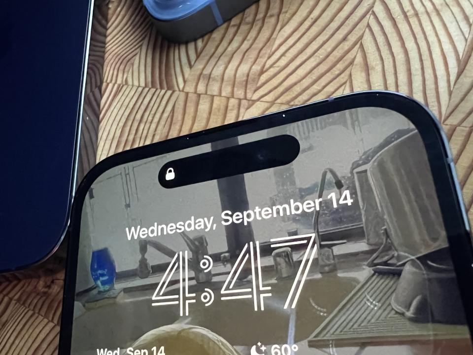
As I said above, I think that this whole Dynamic Island situation is one of the better UI turnaround jobs I’ve ever seen. The "notch" that houses the front camera, True Depth array and proximity sensor has been a lightning rod for critique ever since its introduction. To see Apple go from trying to hide it to at least acknowledging and owning it and then onward into full on lean-in mode with this new pill-shaped dynamic area has been pretty enjoyable.
Instead of another year of pretending that they love the notch and everything is fine, Apple has turned that area into something that’s actually useful and interesting.
Image Credits: Matthew Panzarino / TechCrunch
Before we get into function, there are a couple of interesting things worth noting about the pill itself.
The camera is a separate unit off to the right.
The True Depth array is in its own little area.
The proximity sensor is hidden under the screen.
Apple is using hardware anti-aliasing to blend the edges of the screen with the expanded edges of the pill when it’s activated to make everything look seamless. It’s essentially seamlessly mixing a hardware screen edge with a software UI element edge with no differentiation. That’s harder than it appears.
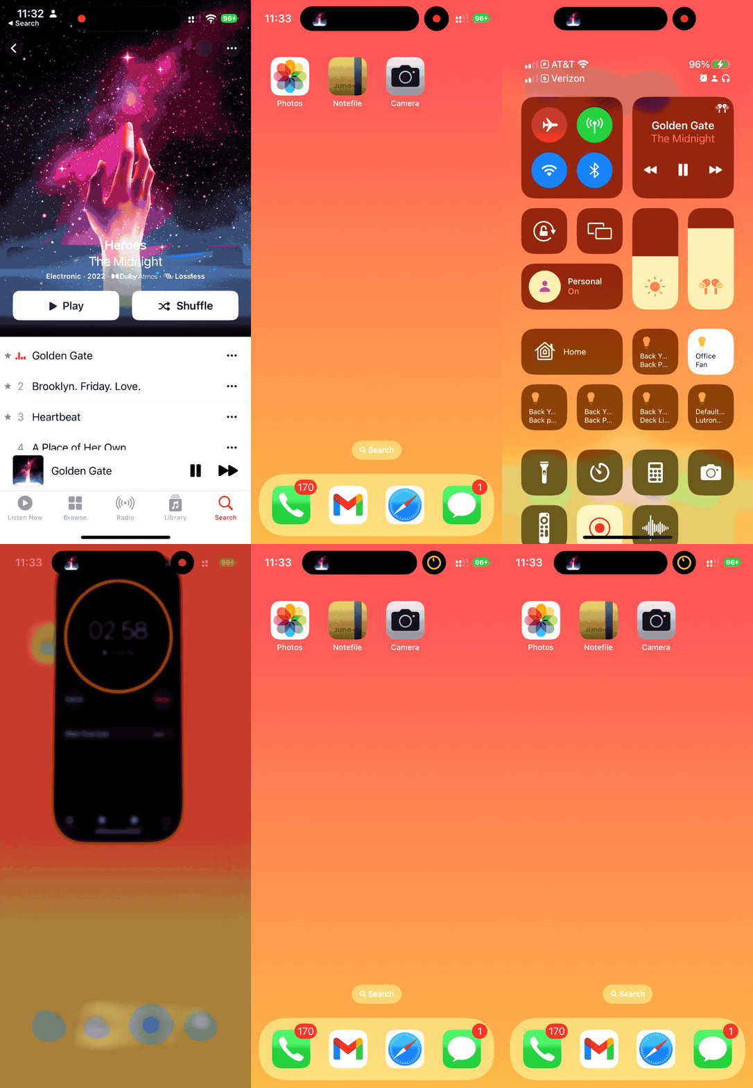
There are three separate APIs that can take advantage of the Dynamic Island. The NowPlaying API for music etc., CallKit for voice apps and, later this year, the Live Activities API that adds a bunch of stuff like sports scores, food orders, ride sharing, fitness workouts etc.
If a third-party app currently uses those shipped APIs it will automatically work with the Dynamic Island.
It’s no surprise that I heard there is some shared DNA between the team that worked on the Dynamic Island and the one that helped design the lock and home screen interactions that replaced the home button. That too was a seemingly improbable feat -- to replace a button that represented one of the single best bits of interaction design ever in consumer hardware with…swipes.
Image Credits: Matthew Panzarino / TechCrunch
In practice, the Dynamic Island works. It becomes a sort of ferrofluidic blob that expands and contracts as needed. Alerts bloop into the island with a stretchy little expansion that blooms out the bottom -- Face ID’s activity icon lives here next to the camera, finally, making you look where you need to look. They then absorb back into the pill when they’re done.
Ongoing activities slither out the sides, expanding the pill shape to enclose their icons or voice-meters and what have you. The pill can absorb up to two recent ongoing background actions and will then begin to prioritize them as they come in using a ranking algorithm to sort them, surfacing the ones that are the most vital. If you are navigating, you have an active phone call and a personal hotspot on, for instance, you’ll likely see the call and the navigation. When the call ends, your hotspot icon will re-appear.
There’s also this extremely subtle breathing action it does after you collapse a new activity into it. Watch closely after you swipe away from an app and it disappears into the island. Over the next second or so it ever so slightly contracts down to a lower profile. It’s super subtle but a great little detail that makes it feel more like a living part of the interface.
Image Credits: Matthew Panzarino / TechCrunch
And yes, the area is reactive. The touch array stops at the edge of the area but Apple uses touch heuristics to make it feel like the area is touch sensitive given the size of your finger and how it will likely connect with the sensitive areas around the pill. They know where you want to touch because of the implication.
You can press and hold for actions on ongoing activities or tap to go to a respective app.
The feature is not without its quirks and rough spots. The alignment of icons and activities across the length of the pill leaves something to be desired. At times the edges of text associated with things like timers will get cropped off by the edges of the pill, though only slightly. All of this feels juuuuust a tad fresh. Given that the Dynamic Island is a "marquee" feature, I’m guessing that these will get polish passes sooner rather than later.
Overall though, it actually does work. It turns an area of the phone that everyone wanted to forget about is the beating heart of the active interface.
I will add one note for those who just hate the whole idea of the pill shape sitting up there. If your iPhone is on dark mode you’re pretty much almost never going to see it unless there are icons in it. Pro tip, etc.

Image Credits: Bryce Durbin
This year’s iPhone models deliver a strong series of upgrades across the spectrum of hardware and software. It’s increasingly difficult to recommend that anyone get the new iPhone every year. This year the safety and camera options might be the tipping point for those early early adopters -- but if that’s you, you’ve probably already preordered anyway. However, for anyone who has held off for two or three years, this is probably the easiest upgrade now recommendation I’ve been able to give in years. Both the iPhone 14 and the iPhone 14 Pro got material updates across their major feature sets.

 Yahoo Movies