
 Yahoo Movies
 How to use clashing patterns in your home, according to design experts
Ask any design lover to describe British interiors, and the response would usually be peppered with indefinables – it's mix and match, old and new, both light and playful, and heavy with tradition. In wrestling together this hodgepodge of styles, we've become quite adept at making it all look quite appealing.
British homes are full of clashing patterns that seems too eclectic to be intentional, yet too stylish to be accidental. There is of course intention behind them, as well as considerable design acumen.
Here, we share some decorating tricks for mixing pattern effectively, as well as some invaluable insights from design experts.
Start small
For a modest go at clashing patterns, start small with your soft furnishings.
"Patterned accessories can bring character into your home and also fit in with the surrounding environment. The secret is to choose patterns that will catch the eye with unexpected colour pairings like romantic floral patterns for bedding and deep blue sea and lime green striped towels." says Lucy Ackroyd, Head of Design at Christy.
Feature patterns, like a leopard print, gingham, or big stripes, are quite a safe choice here as they are generally used as accents – much in the way that you can have a colourful feature chair in a living room without it feeling out of place.
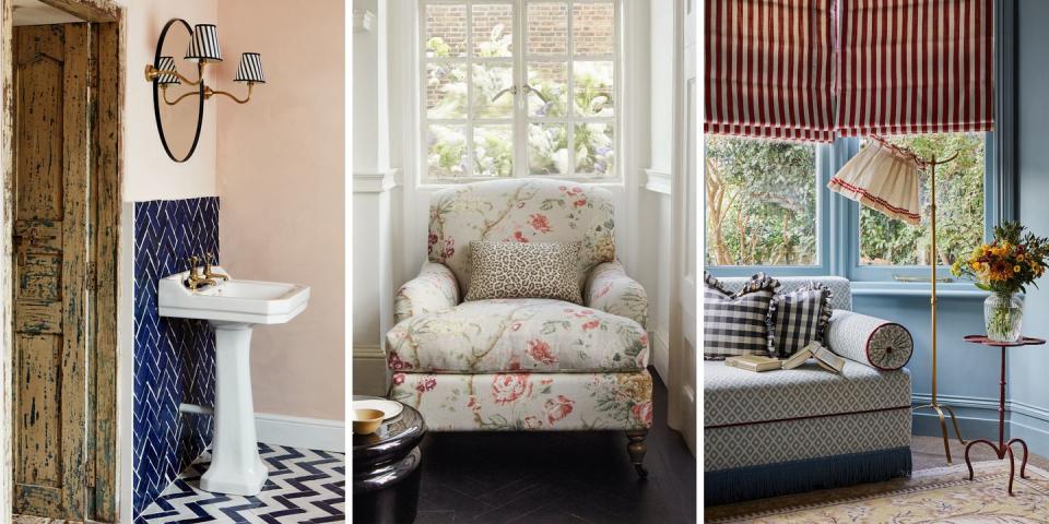
Clash in compact spaces
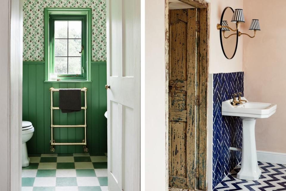
The bathroom or downstairs loo is quite a common space for a bit of design experimentation, given that it is usually a small and unobtrusive canvas.
It's relatively easy to clash patterns here as there are so many options for zig zag, herringbone, or checkered floor tiles that can be accompanied by a playful wallpaper. This fabulous green bathrooms from Bert & May, uses a reliable decorating trick of sticking to just two core colours (more on that below,) and combining stringent lines with the more organic shapes in a floral wallpaper.
The designer's take
Interior designer, Laura Stephens, has a wonderful ability for mixing patterns, with a result that is colourful, inviting and quintessentially British way. Laura shares her tips for achieving a similar result.
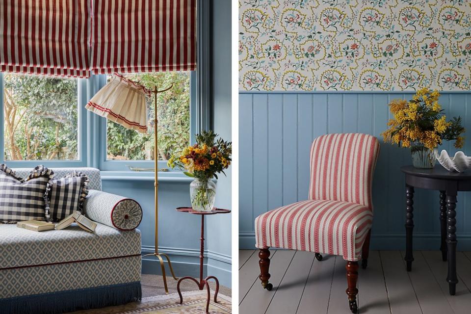
"I love to use prints which don’t look too ‘matchy’ but still work well together. A favourite trick is using stripes with a bold floral print such as in this bathroom. Here I picked the coral colour from the wallpaper and used a coral stripe from Blithfield on an occasional chair.
In the playroom above a more subtle and traditional jacquard fabric on the sofa allowed me to use a bold stripe and throw in a gingham to make the scheme more playful and quirky. In general don’t be afraid of mixing prints both at large and small scales together . Use a graphic stripe or check with a floral.
Using a range of prints together makes a scheme feel less contrived and more layered and personal."
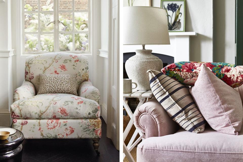
Match your colours but mix your patterns
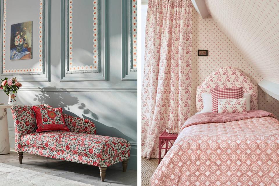
This is a pretty safe approach to take when clashing your patterns because it creates some coherence in a room. Pick a small palette, fewer than three colours is ideal, and use them across your clashing prints.
You can be as bold or as subtle as you like – on one hand, a sweet scalloped motif picks up the red roses in this Cath Kidston x DFS chaise, and on the other, Colefax and Fowler have created a bold bedroom with three different prints in the same colour way.
Amy Wilson, interior designer for 247 Curtains, suggests focusing your pattern clash on your window dressing. "Curtains present a real opportunity to make a statement at your window. There are some incredible fabrics available and when drawn in the evening, curtains can complete your room. For an opulent and maximalist scheme, you should consider clashing patterns like floral curtains against a backdrop of striped wallpaper or bold paint."
Clash your textures
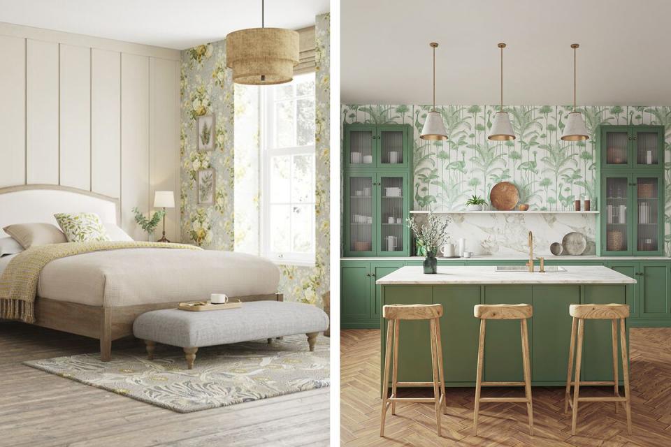
This is another safe option for those with more modest tastes. Look for any rooms or pockets in your home with strict lines – a herringbone floor, like in this fabulous green kitchen, a simple metro tile, or a more subtle wall panelling – and treat this as your base pattern. From there you can juxtapose something quite dramatic, like a big blousy floral or indeed a tropical wallpaper like this Crane Fonda in Palm Green from Divine Savages.
The only caveat here – don't treat your texture and pattern as separate design entities. If you have a mahogany floor for instance, you might want to use warmer colours in your pattern to complement its richer tones.
You Might Also Like
